
03 Mar 2014 Android Phones and Janky Accordions

Mobile web apps have come a long way from their clunky, cut-down ancestors of the pre-smartphone era. Responsive design and mobile-specific interactions such as touch and swipe events have begun to bridge the gap between mobile web-apps and native smartphone applications. So unsurprisingly, when working with a mobile web app we are often tasked with aiming not only for feature-parity with a corresponding native app, but for UI-parity as well.
While plenty of arguments can be made against this approach to begin with, on a recent mobile web-app project we were curious to see how far we could go when tasked with pursuing the native ideal.
Parity across the layout of the pages is simple enough, but the native UI experience is about so much more than just layout. All of the seemingly-insignificant things in the periphery – page transitions, modal dialogs, the now ubiquitous left-hand slide-in navigation bar – are crucial. However, there was one element that we didn’t expect to cause any problems, particularly given how widely used it is – the humble accordion.
The Problem With Accordions
For those who are a little hazy as to what an accordion is: it’s a UI component comprising multiple sections, each of which can be opened and closed to show and hide content. Here’s an example of an accordion in action:

Opening and closing accordions is no issue. Animating these transitions whilst progressively revealing the internal content is a different story. In our initial implementation we found that performance when opening an accordion on both an iPhone5 and a Samsung Galaxy S4 ranged from average to shockingly unacceptable. What should have been a smooth slide-down animation was slightly stuttery on the iPhone and a total bust on the S4 – you could barely tell that it was animating at all between the closed and open states.
By this point we had already implemented pages sliding in from the left and right with silky smoothness – how could this be any different? The problem lies with how the page responds to the accordion opening.
The slide-in transitions made use of CSS3 hardware acceleration on the mobile devices. As these transitions simply slid one page to the right and another page into its place, the layout of both pages was unchanged, which is easy enough for the mobile device to handle.
However, when an accordion opens, the layout of the page needs to be recalculated as a result of the change of height. Consequently, it does not get hardware-accelerated. How expensive this recalculation is depends on a variety of factors, but most broadly relates to how complex the DOM is. As the height of the accordion’s content increases incrementally, this reflow event occurs over and over again, and ends up killing the performance of the animation.
While desktops usually have the processing power to mask this issue, it’s glaringly obvious on a smartphone.
Exhibit A
Let’s start with a naive jQuery implementation of an accordion. The source looks like this:
</pre> <div class="accordion" id="accordion1"> <div class="header">Header 1</div> <div class="content">Content</div> </div> <pre>$(document).ready(function () { $('.header').click(function (e) { // select the content div var $content = $(e.currentTarget).next(); if (!$content.is(':visible')) { $content.slideDown(); } else { $content.slideUp(); } }); });(You can find the JSFiddle here)
This is as simple as it gets, and actually gets a chance to perform well since there is little DOM clutter. So how well does it behave across devices?
Whilst the gap between the desktop performance and the mobile devices is understandable, the gap between the iPhone 5 and the Galaxy S4 is harder to fathom. That said, this example uses the jQuery
slideDown()method to open the accordion, programatically altering the height of the specified div to open and close it. Perhaps we just didn’t give it a chance to leverage any hardware acceleration?Exhibit B
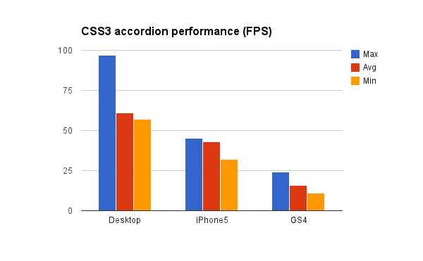
Let’s try an approach that uses CSS3 animations:
.content { overflow:hidden; height: 0px; -webkit-transition: height 0.4s ease; } .content.open { // Ideally this should be set dynamically by the js height: 650px; }$(document).ready(function () { $('.header').click(function (e) { var $content = $(e.currentTarget).next(); if (!$content.hasClass('open')) { $content.addClass('open'); } else { $content.removeClass('open'); } }); });(JSFiddle is here)
We see that CSS3 transitions are applied via a class; that the browser will attempt to transition the element between the two states whenever the class is added to a DOM element. If the browser doesn’t support CSS3 transitions, it degrades gracefully such that the accordion simply snaps to the open position.
But how does it perform?
In terms of absolute numbers, the performance data certainly looks better with this approach, but it’s important to note again that this test is operating within a very minimal DOM; in our experience, real-world performance is likely to be worse depending on how complex the DOM is and thus how many reflows are forced.
In relative terms, animation is still less of a problem on the iPhone than the S4. This reflects our broader experiences with iOS vs Android – we’ve seen a HTC One perform as badly as the S4. Apple, on the other hand, seems intent on making browser performance first-priority, even if it’s at the expense of emerging standards (consider their recent removal of shadow DOM support from webkit to help achieve 60fps performance).
Conclusion
People think that CSS3 will fix all of their animation performance issues, but this is not the case if layout is recomputed. Whilst this may sound like an edge case, it not a big ask for an accordion expand smoothly.
While the examples that I’ve given look at the very basics that affect transition performance on mobiles, there is a wealth of lightweight libraries out there that can further optimise transitions to appear smoother for the end-user. That said, you could also argue that a smooth, native-like experience belongs to native apps themselves, and that web apps should primarily be function over form.
The take-home message from all this (other than ‘don’t bite off more than you can chew’) is that reducing the impact of reflows on the DOM plays a large part in how the web page is going to perform. You can achieve this by reducing the depth and complexity of the DOM, or cleaning up unused or redundant CSS selectors. Animating elements that have position-absolute or position-fixed will also prevent them from causing a reflow of their parent elements.
Alternatively, we can hope that this year’s refresh of smartphones (including the just-announced Galaxy S5) will bring us ever-more processing power and finally allow accordions to open smoothly. Failing that, there’s always next year’s phones…or the year after…

No Comments